
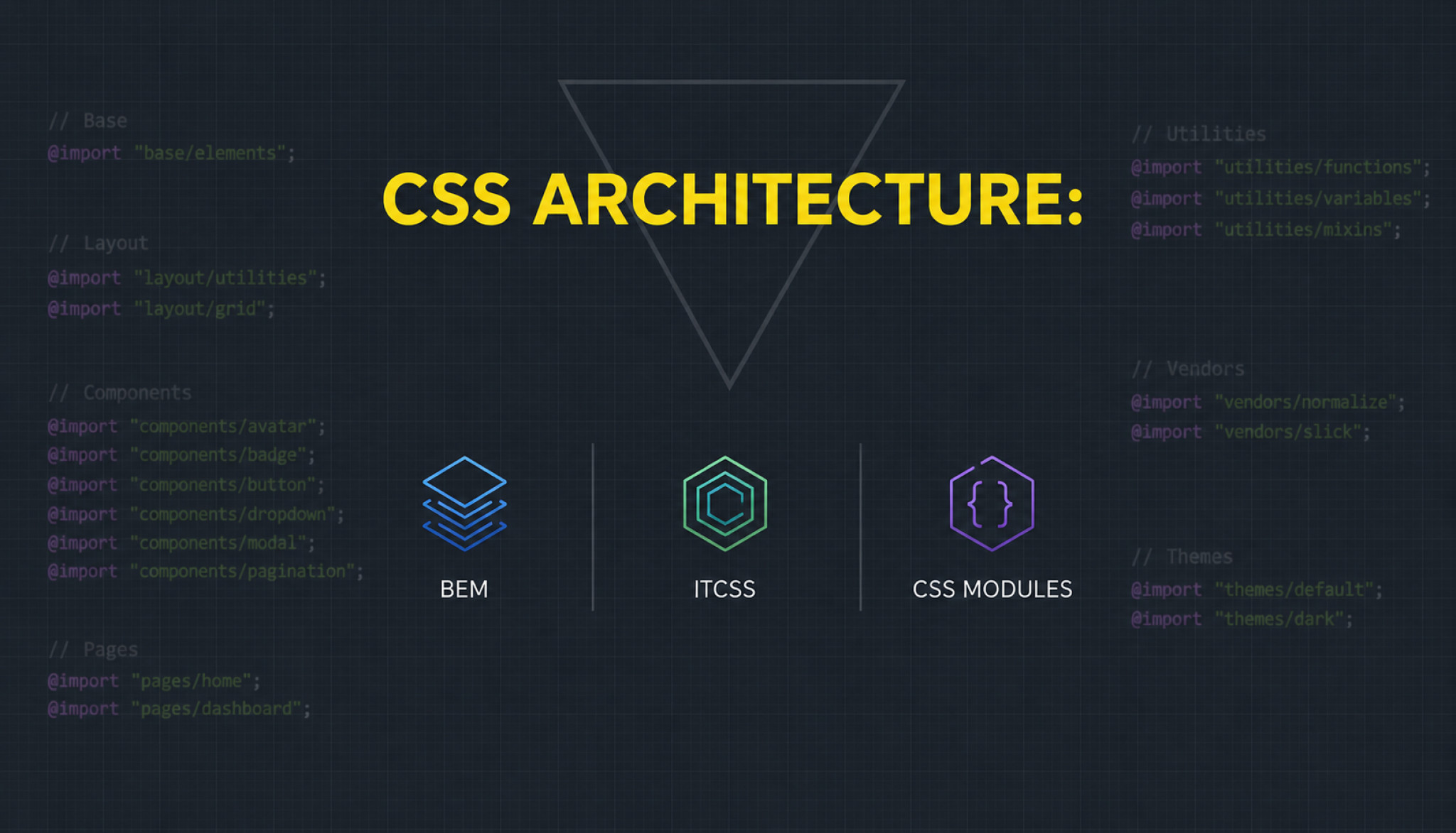
Why CSS Is Hard at Scale
CSS is famously easy to start writing and notoriously difficult to maintain at scale. The properties of CSS that make it approachable for small projects — the global scope of all selectors, the cascade that allows any rule to override any other rule, the inheritance that propagates values from parent to child elements — are the same properties that make large CSS codebases difficult to manage. The button style that worked perfectly when first written is broken six months later by a more specific selector that was added for a different purpose. The colour value that was defined globally is overridden by a more specific rule in a component that was written by a different developer. The padding that looks right in isolation affects the layout of every adjacent element in ways that were not anticipated when the rule was written.
The CSS architecture problem that most development teams eventually encounter: the confidence problem. The developer who is afraid to delete or change a CSS rule because they do not know what else it might affect is working in a codebase where CSS has become a source of fear rather than a tool. The dead code that accumulates because rules might be doing something somewhere, the workarounds that multiply because the actual fix seems too risky, and the specificity arms race where increasingly specific selectors are added to override other increasingly specific selectors — these are the symptoms of a CSS codebase without adequate architectural constraints.
BEM: Naming Conventions That Prevent Collisions
Block Element Modifier (BEM) is a naming convention for CSS classes that provides a systematic approach to avoiding the selector collision and unintended cascade that cause CSS maintenance problems at scale. The BEM naming pattern organises CSS classes into three categories: the Block (a standalone component — .card, .button, .navigation), the Element (a part of a block that has no standalone meaning — .card__title, .card__image, .button__icon), and the Modifier (a flag on a block or element that changes its appearance or behaviour — .button–primary, .card–featured, .navigation__item–active). The double underscore separates blocks from elements; the double hyphen separates blocks or elements from their modifiers.
The BEM advantage that most distinguishes it from unstructured CSS: the local scope that the naming convention provides without requiring any additional tooling. The .card__title class can only belong to a card component by convention — it will not accidentally affect elements that happen to have the title class in a different context. This naming discipline, consistently applied, eliminates the most common source of CSS selector conflicts in large codebases without requiring CSS Modules, CSS-in-JS, or any build-time CSS scoping mechanism. The trade-off: the class names become verbose, and the discipline requires team-wide adherence to be effective.
Utility-First CSS: Tailwind and the Atomic Approach
The utility-first CSS approach, most prominently implemented by Tailwind CSS, inverts the conventional CSS architecture: instead of writing custom CSS classes that describe semantic concepts (the .button-primary class, the .card-featured class), utility-first CSS uses predefined, single-purpose utility classes directly in the HTML (class names like bg-blue-500, px-4, rounded-lg, font-bold). The component’s visual appearance is entirely defined by the combination of utility classes applied to it in the HTML, with no custom CSS written for most components.
The utility-first CSS trade-off that most divides developers into enthusiastic adopters and skeptical critics: the HTML verbosity that extensive class lists produce. The button element that required one or two semantic class names in conventional CSS requires fifteen to twenty utility classes in Tailwind — a difference that critics find unreadable and maintainers find difficult to scan. The adopters argue that the utility classes are more explicit (every visual property is visible in the HTML without opening a CSS file), more predictable (utility classes do not cascade or conflict), and faster to write (no naming decisions, no context switching between HTML and CSS files). Both positions have merit, and the preference is partly aesthetic and partly reflective of the team’s working style.
CSS-in-JS: Scoping Styles to Components
CSS-in-JS libraries (styled-components, Emotion, and others) address the CSS scoping problem by writing CSS in JavaScript, typically as tagged template literals or object styles attached to React components. The component’s styles are scoped to that component automatically — the CSS generated by a styled-component is applied only to that component’s rendered elements, without requiring BEM naming or any explicit scoping convention. The styles are co-located with the component code, making it easy to find and modify the styles for any specific component without searching through separate CSS files.
The CSS-in-JS performance consideration that most affects the choice between CSS-in-JS and other approaches for performance-sensitive applications: the runtime cost of generating CSS from JavaScript and injecting it into the document. Traditional CSS-in-JS libraries (styled-components, Emotion) generate class names and inject styles at runtime — on the client, as the components render. This runtime cost is acceptable for many applications but is a measurable overhead for applications that render many components or that need to minimise the JavaScript work that blocks interactivity. Zero-runtime CSS-in-JS alternatives (vanilla-extract, linaria) extract styles at build time, producing static CSS files that the browser receives as traditional stylesheets without JavaScript overhead — combining the developer experience benefits of CSS-in-JS with the runtime performance of traditional CSS.
Choosing a CSS Architecture for Your Project
The CSS architecture selection framework that most efficiently guides the choice for a specific project: the team familiarity factor (the architecture that the team already knows provides immediate productivity that learning curve overcomes slowly — changing CSS architecture mid-project is expensive), the toolchain compatibility (CSS Modules and CSS-in-JS require build tool support; utility-first CSS requires the utility framework to be configured; BEM requires only naming convention discipline), and the codebase scale and team size (BEM and utility-first approaches scale well with large teams because they provide constraints that prevent CSS conflicts without requiring runtime tooling; CSS-in-JS scales well in component-heavy React applications where style co-location with component logic is valued).
The CSS architecture migration strategy that most minimises disruption when changing an existing codebase’s approach: the strangler fig pattern applied to CSS — introducing the new architecture for new components while leaving existing components in the old architecture, gradually replacing existing components as they are modified for other reasons rather than undertaking a wholesale rewrite. The CSS codebase that is half BEM and half utility-first is messy by architectural standards but functional in practice — and the gradual migration that does not require a large dedicated effort is more likely to be completed than the big-bang rewrite that competes with feature development for engineering time.